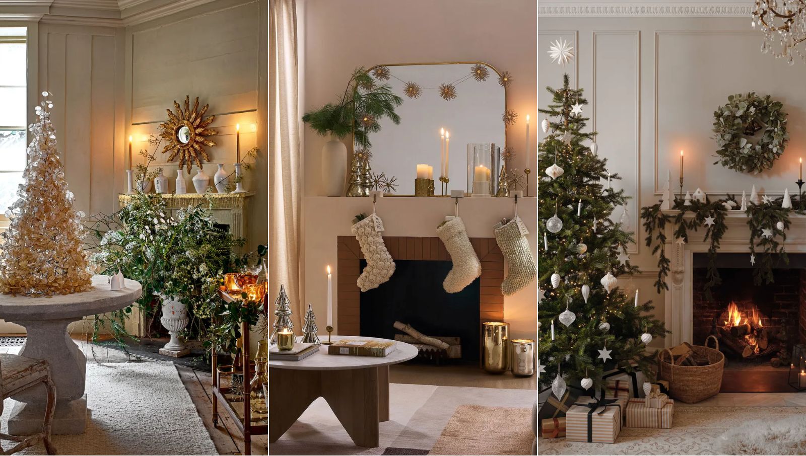
Christmas decorating can easily drift from festive to visually noisy. Between tinsel, lights, ornaments, wreaths, tableware and gift wrap, there are a lot of competing elements fighting for attention. A calm and elegant Christmas look doesn’t happen by buying more decorations; it comes from choosing a clear colour palette and sticking to it with discipline.
A strong palette gives every choice a purpose. It helps a tree feel styled rather than overloaded, makes a table setting feel considered, and creates a more cohesive atmosphere across the home. This is where accents such as decorative blue baubles for festive displays can be especially effective, adding depth and refinement without relying on the usual red-and-green formula.
Start With the Mood, Not the Colours
Before choosing colours, decide how the space should feel. Calm and elegant can mean several things. It might be coastal and relaxed, soft and wintry, rich and traditional, or minimal and contemporary. The mistake many people make is starting with individual decorations they like, then trying to make them work together later.
Instead, begin with mood words. Serene. Warm. Polished. Natural. Romantic. Crisp. Once you know the emotional direction, the colour decisions become easier.
For example, a calm coastal Christmas might centre on ivory, muted blue, brushed silver and natural timber. A more formal look might use deep navy, champagne, pearl and glass. A softer family home might combine warm white, sage, pale gold and linen. Each version feels festive, but none relies on clutter.
Choose One Dominant Colour
A refined palette usually needs hierarchy. That means one colour should lead, with the others supporting it. Without a dominant colour, the eye has nowhere to rest.
Your dominant shade might be warm white, soft green, deep blue, champagne, charcoal, natural brown or classic ivory. This colour should appear most often across the tree, garlands, table linen, wrapping paper or larger decorative pieces.
Using a neutral as the dominant colour is often the safest path to a calm result. It creates breathing space and lets smaller accent colours feel deliberate rather than scattered. A tree built around ivory, for instance, can carry gold, blue, green or silver accents without feeling busy.
Add Two Supporting Colours
Once the main colour is set, choose one or two supporting colours. These should bring contrast, warmth or depth, but they shouldn’t compete for dominance.
A practical formula is:
- Dominant colour: 60 per cent
- Supporting colour: 30 per cent
- Accent colour: 10 per cent
This doesn’t need to be mathematically exact, but it’s a useful guide. If everything appears in equal measure, the result can feel flat or chaotic. If one colour leads and the others repeat in smaller doses, the whole scheme feels more intentional. For a calm Christmas palette, avoid using too many saturated colours together. Rich red, emerald green, bright gold and icy silver can all look beautiful, but used equally, they can overwhelm a room. Editing is what creates elegance.
Use Blue for Quiet Sophistication
Blue is one of the most underused Christmas colours, yet it’s ideal for creating a composed, elevated look. Deep navy brings formality and contrast. Dusty blue feels soft and contemporary. Icy blue can create a wintry, luminous effect, especially when paired with white glass, silver, pearl or crystal finishes.
Blue also works well because it doesn’t fight with greenery. Against pine, eucalyptus or fir branches, blue ornaments provide a cooler counterpoint that feels fresh without being stark. It can also modernise traditional Christmas styling, particularly when used in baubles, ribbon, candles, gift wrap or table accents.
The key is repetition. One blue ornament can look accidental. A controlled thread of blue across the tree, mantel and dining table looks designed.
Balance Shine With Softness
Elegant Christmas styling isn’t only about colour; texture matters just as much. A palette can feel harsh if every surface is glossy, metallic or glittered. Calm spaces need contrast.
Combine reflective finishes with softer materials. Think glass baubles against velvet ribbon, matte ceramics beside polished candle holders, linen napkins with metallic place cards, or paper ornaments mixed with delicate glass pieces. This balance stops the palette from feeling too commercial or showroom-perfect.
For a more relaxed Australian Christmas, natural textures work particularly well. Timber, rattan, linen, cotton, stoneware and dried foliage can soften metallics and make the scheme feel grounded.
Keep Metallics Restrained
Gold, silver, bronze and champagne are useful festive neutrals, but they need restraint. Too many metallic finishes can make a palette feel restless.
Pick one main metallic and repeat it consistently. Champagne gold is softer than bright yellow gold and works beautifully with ivory, sage, blush, navy and warm white. Silver suits cooler palettes, especially blue, white, charcoal and glass. Bronze can add depth to earthy schemes with olive, cream and timber.
Avoid mixing every metallic finish unless the space already has an eclectic style. A calm palette benefits from fewer decisions, repeated confidently.
Consider the Room Around the Decorations
A Christmas palette shouldn’t ignore the existing room. Wall colour, flooring, furniture, artwork and soft furnishings all influence how decorations will read.
A home with warm timber floors may suit cream, gold, olive, rust, burgundy or soft blue. A white or grey interior can carry cooler tones such as silver, navy, ice blue and glass. A room with colourful artwork may need a quieter Christmas palette so the space doesn’t feel visually crowded.
Look at what’s already there, then choose festive colours that belong in the room rather than fighting against it.
Edit Before You Add
A calm Christmas scheme often comes down to removal. Once everything is decorated, step back and look for anything that feels out of place. The odd colour. The extra ribbon. The ornament that belongs to another style. The table piece that blocks conversation.
Editing doesn’t make a space less festive. It makes the festive details stronger.
Intentional decorating is less about perfection and more about clarity. When colours repeat, textures are balanced and accents are used with purpose, the whole home feels calmer. The result is still warm, celebratory and unmistakably Christmassy, but with more polish and far less visual noise.

Rockies Ripple is the founder and lead writer behind the independent blog tvplutos.com